I broke my toaster yesterday, and it’s the stupidest story you’ve ever heard. But I’m going to tell you anyway because at its core is a lesson we all need to learn about good design.
The toaster was my husband’s, which he’s had since before we were married four years ago. It’s beautiful, it’s sturdy. It toasts 4 slices at a time and allows you to choose from 5 different settings so that you can defrost your bagels while warming your bread and not ruin either one. The LED displays the time so you know exactly how much time is left. It’s a premium toaster.
Except for one fatal flaw: the tabs that you press down so you can actually toast the bread? They’re plastic. They’re just glued on to some skinny metal legs.
Which I know because yesterday when I went to make toast by pressing down on the lever–as you do– the damn tab came right off in my hands!
Without it, you can’t press the toast all the way down, and there’s too much strain for glue to be helpful. I know because I tried after the first one broke off six months ago.
I now have a perfectly wonderful toaster, and no way to use it.
Design For Form and Function
Whether you believe that form follows function or function follows form, we can all agree that function matters.
To design a beautiful, practical toaster that breaks when used to do the very thing it was created for is to design it badly.
To build a website that is beautiful and functional requires skilled design. And with websites, a skillfully designed website cannot be accomplished without excellent copywriting.
There are so many wonderful platforms today that can build beautiful websites for people. They’re well-designed, professional-looking and customizable. There are so many beautiful websites that look impressive and slick but you can’t find a damn bit of information you’re looking for. Or you can, but it isn’t clear and intuitive. You stumble over the writing.
Great web design doesn’t leave copy to the end. It integrates it into the design process from the beginning. The copy–the words, the phrasing, the language–you use on a web page are both the structure and the embellishments of your design.
Get it right and you get your goal.
Get it wrong and a whole lot of people leave your site frustrated and empty-handed, perhaps never to return.
Like form and function, copy and design go hand in hand.
What does a good copy-design relationship look like?
Copy and Design, Hand in Hand
Good designers know that website visitors don’t read every word on a web site. We scan pages, using the hierarchy of design to orient us. We view headlines (big and bold), subheadings (smaller, bold), keywords, visuals and layout to take us down a page and to glean information.
When a web page is difficult to scan, users tend to click away from the page, opting for an easier site. When information is hard to find because of poor design, we click away then too. There are billions of websites on the internet right now and more created every second. If your website is difficult to read, to navigate, why not go find a better one?
Presenting information in a quickly digestible way is crucial to the success of your business.
Your job as the designer, then, is to make the page easy to scan.
As copywriter, write copy that blends in, that supports the design, that guides the user through the page–and do it all without ever being noticed.
There are four elements you must follow to have a well-designed, well-written (ie beautiful, functional, non-frustrating) website:
- Good balance of text and copy. Sites that are too word-heavy are difficult to read, and highly unattractive. Sites with too few words are often missing important information.
- An effective call to action (CTA) The call to action should be so natural you don’t even realize the call was made.
- Clear menu headings (including words and structure). Your visitor isn’t there to think about where to go, but to be led to his destination. Lead the way. Make navigating intuitive.
- Straightforward copy. Concise, economic, efficient. Words are for function, not decor.
We’re going to break down all of these elements using real examples in a segment we’re calling:
DESIGN SMACKDOWN: WHO WILL GET MY MONEY?
Two sites are going to faceoff in a competition of great design. The winner gets me as their customer.
ROUND 1: BLOGGING PLATFORMS
Squarespace vs. Wix
SQUARESPACE

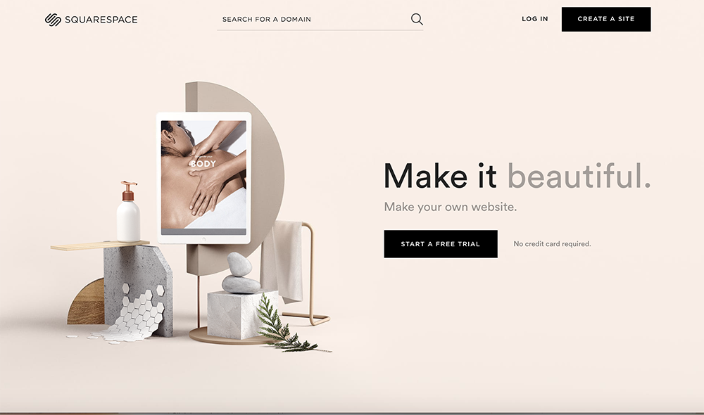
Wow. There are 25 words on the page, but it looks like there are no more than 7. I see immediately how beautiful and sleek Squarespace can make a website.
Balance. It says exactly what I need to know and not a thing more. “Make your own website” is a 4-word summary of the product (bonus points for efficiency) and their pitch (3 words!) changes periodically (“make it beautiful”, “make it loud” etc), reflecting the platform’s versatility.
CTA. I’m invited to start a free trial, and immediately assured that I won’t even need a credit card (a question that immediately popped up when I saw “free trial”). It doesn’t give details, just quietly removes the barriers. Perfect.
Navigation. At the top I have three clear options and I don’t have to think at all about what each one does. I scroll down and see “Trusted by” and don’t bother reading the rest because the layout makes it clear that this is a well-established, widely-used, trustworthy site for people of all industries.

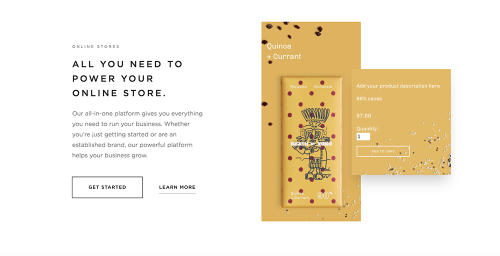
Copy. They highlight four benefits of using Squarespace (design, marketing, online shopping, all-in-one platform) and there’s not an extraneous word to be found. All the copy is focused on me and how Squarespace will achieve my goals. The visuals are effective at answering the “how” and the two options “Get Started” and “Learn More” (with Get Started being more prominent–I just want to click it!) are effectively designed to get me to yes.
WIX

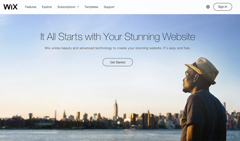
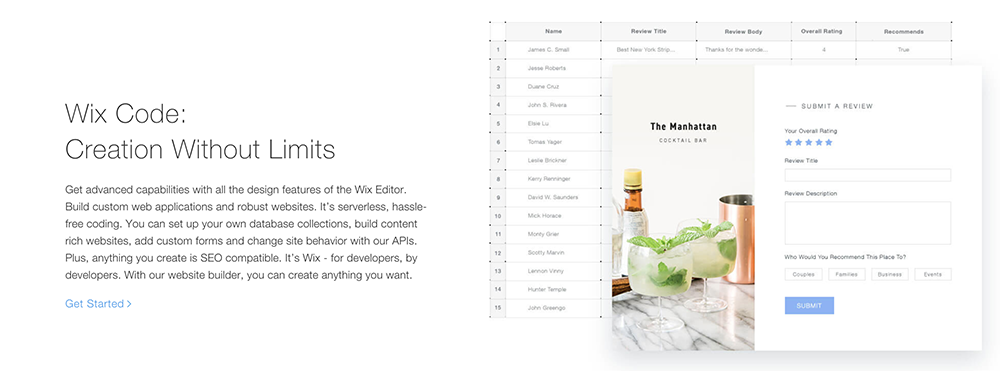
Balance. Just for comparison, I counted the number of words on this page: 32. It feels like there are a lot more words here than on Squarespace’s homepage, and they’re not all that valuable. Like, what does “stunning” mean? Squarespace showed exactly what it meant by “beautiful”, “loud”, “fresh” and the blinking cursor drove home the message of customizability.
“Wix unites beauty and advanced technology to create your stunning website. It’s easy and free.” None of that is bad exactly, but they already used “stunning” and, like, do we need advanced technology? The only thing that really matters to me is “It’s easy and free.” That’s what needs to be front and center!
CTA. Get Started. I like that. It gets right to the point and without scaring me off.
Navigation. I have to think about what I want, what part of the menu to click on. I see now why Squarespace decided to forego the header menu and to focus instead on four main benefits. In this case, visual is way more effective.
Copy. These descriptions look twice as long with too-small font that makes me not want to read. The pictures don’t support the text (Why the spreadsheet? Why the review? And what do they have to do with code?)

It’s jargon-y. You have to explain wix code to me. It may be a small barrier, but as long as it’s there, I can trip.
When I scan Squarespace’s page, I can pick out keywords like “marketing” “online store” “grow your audience”. I can’t do that with Wix.
WINNER ROUND 1: SQUARESPACE!
ROUND 2: ONLINE SHOPPING
Target vs. Walmart
TARGET

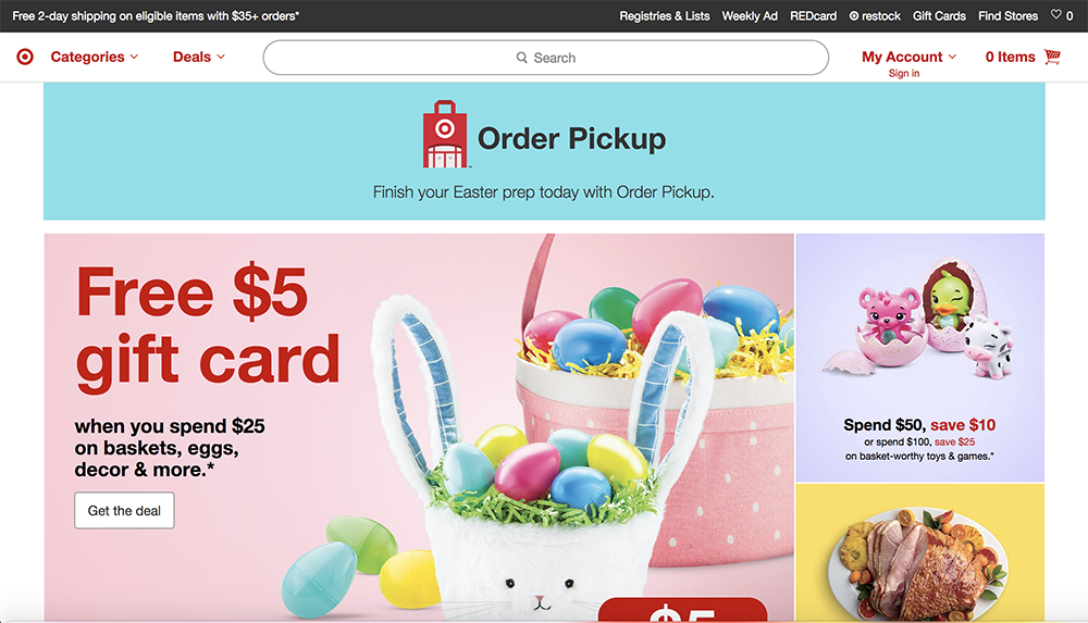
I immediately notice: Easter. Pickup. Search. Save. Take note, those are four keywords that help me navigate without thinking. The colors are attractive, the visuals uncluttered, and the search bar at the top is prominent. I don’t have to think about how to get where I want to go. I just scroll down.
Balance. Initially I thought there were very few words, but now I see there are two menus at the top. (Take note: it’s excellent design when you can trick me into thinking the page is less crowded than it is.)
Very few words, and mostly action-oriented: “spend” “save” “get”. The pictures show me what I may want and the words tell me why it’s a good idea to buy.
CTA. Get the deal is perfect. I always want a deal! It supports the rest of the page, and I almost don’t notice that the deal means I have to spend first.
Navigation & Copy are where this site shines. I want to show two examples.

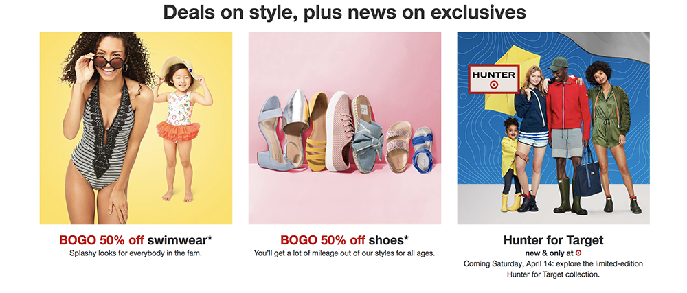
You could say this in two words, “news and exclusives” but here’s what’s clever about their approach. Saying “news on exclusives” makes it clear that it’s newsworthy, and it elevates Target’s brand a smidge by showing it’s not the same old stuff here day after day. It also keeps readers engaged because who doesn’t like to be in on the scoop? Also, Target is a brand that does exclusives. I want to know what and when the next one is, and Target wants to remind me of that competitive edge.

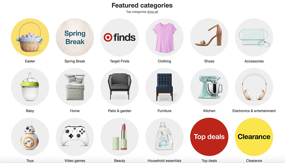
Featured categories is so economical. Great use of color, clear images, and words. I can find what I want just by looking at the pictures, or I can read the text. Well done.
WALMART

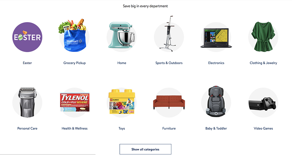
ACK SO MANY WORDS. My eyes don’t move easily in any direction, and I’m not sure where to look first. It takes some brain power to orient myself and decide where to go.
Balance. I don’t know where to go, so I just keep scrolling. The featured products have LOTS of information: reviews, number of reviews, number of stars, a small title, sometimes info on shipping. All that information makes me think and process, and that’s a drag in online shopping.
CTA. Is there a CTA here? I feel like I’m shouted out from all directions.

Navigation. “Show all categories” is a barrier, and we don’t want barriers. I was going to comment on Walmart’s lack of order here, but when I went I looked back at Target’s to compare, I realized they didn’t have any either. It was just an illusion. Let that be a lesson to you.
Are you still anxious about the water you drink every day from your fridge or refrigerator is unhealthy or looking for a new and premium water filter to replace the old one of your refrigerator?w10295370a water filter EDR1RXD1 can greatly remove chlorine, lead, mercury, cadmium and thallium that are harmful to our human’ health.
Replaced model w10295370
For your peace of mind, ourW10295370 with up to 6-month longer life is quality approved by IAPMO and ISO 9001 to serve you cleaner, fresher, better-tasting and wholesome water.
to enjoy a much healthier household drinking water and life from now on.

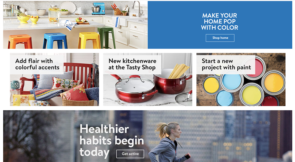
Copy. Yes! Finally they did something brilliant. The images are clear and so is the copy. They support each other in giving me direction. I want to start a DIY and paint my walls and cook my food.
WINNER ROUND 2: TARGET!
ROUND 3: APPLE vs. SAMSUNG
APPLE

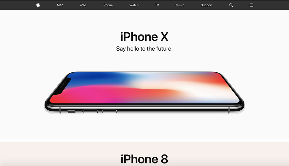
Full disclosure: I’m a devoted Apple fan, and this is why. Their work is so clean and beautiful. This website is just about perfect in every way. Its visual, letting the products speak for themselves with just a few words sprinkled throughout to support the visuals.
Balance. They’re advertising ONE THING, but by showing just a peep of the iPhone 8, they make it clear that there’s more to scroll to. At the top is a header menu in case I want to look at something specific. But, it’s black and white and stays in the background–no distracting me, no competing for attention, no burdening my brain with extraneous thoughts or decisions.
CTA. It’s rare to find a site that doesn’t use CTAs and even rarer to find one so seamlessly integrated. Notice that though the entire image is a link, there’s still a CTA, but it acts as a selling point, a benefit, instead of a call to action. Geniusly executed.
Navigation. Just like with the products, you don’t have to think at all here. Scroll down and click on what’s most beautiful. But, if you are looking for something specific, there’s a discreet little menu that follows you around. You only notice it when you need it.

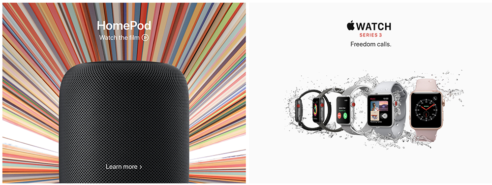
Copy. Homepod tells you to watch the film, to fill your curiosity about this little-known product. I love that “freedom calls” doesn’t say anything explicit about water resistance or the sim card. It’s all implicit in the visuals. Showing the five watches supports the tag line.
The site is filled with clean visuals supported by short sentences that are packed with power. It’s so easy to look around, understand what I’m seeing, and to spend money
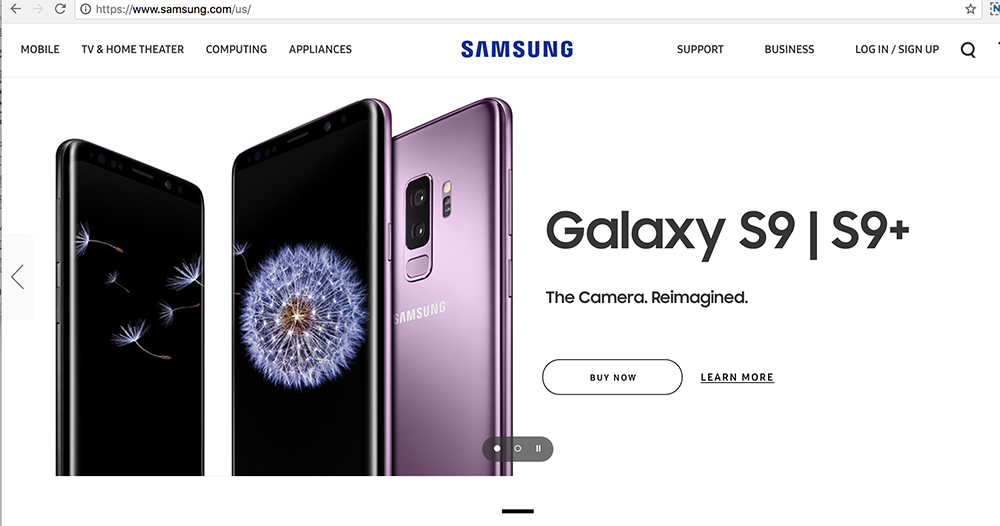
SAMSUNG

Immediately I’m presented with a choice: Do I want the 9 or 9+? Which means that already I’m having to think and process. A well-designed site is so intuitive you don’t even have to think.
Balance. This is a word-heavy home page. It’s not terrible, but as with Wix, the copy isn’t supporting the visuals so much as competing with them.
CTA. “Learn more” sounds boring and I’m already bracing for a pitch. As a general rule, you should avoid “learn more” always. Keep your CTA benefit-oriented.
Navigation. A lot of information is being thrown my way, and in no particular order. When I scroll up for the menu (barrier!), I have to read every word of the submenu to know decide (barrier!) where to go.
Copy. Look at this.

I’m only going to point out three barriers. I welcome you to add more in the comments.
- Try it the Galaxy for 30 days. Sounds like a benefit, but the subtext is, “you may not like it and just in case that’s true, we’ll make it easy to return.” Thumbs down.
- The camera. Reimagined. Tells me nothing about the camera or why I should care that it’s been reimagined. Also, you’re trying to sell me on a camera by showing me a black square.
- Do more with your Galaxy S9 and save on accessory bundles.* What more can I do? WHY THE ASTERISK??
Samsung undercuts its own products over and over again.
WINNER ROUND 3: APPLE!
The Secret? Always KISS
We talked about copy and design going hand in hand. Now it’s time to KISS (keep it simple, stupid).
- Keep your sites people-centered (not product or business-centered).
- Remove barriers. Make it easy for your people to buy!
- Use engaging visuals and brief but powerful phrases. Discourage thinking. Encourage moving.
- Let your product do the talking
It’s much easier to critique sites than to build them great in the first place. But looking at different sites in terms of what’s effective, what’s frustrating, what’s easy to navigate, what compels me to buy–and what doesn’t–can inform our design decisions.
And also our shopping decisions.
Congratulations to all our winners! I’m off to buy some stuff.
