Automate. Improve.
Increase Revenue.
Let’s build the solutions your business needs to grow.
Book a strategy callWe’re always being asked by clients “How do we reach Millennials?”
Millennials aren’t so different from other markets, but no one confounds businesses quite like them. They don’t buy homes, watch TV, get married. They move back in with their parents. How can you possibly reach a market that moves back in with their parents?
Speaking as a Millennial, I have some ideas.
Attractive look, easy feel.My generation has a keen eye for design, and especially ease of use. We grew up with the internet and know both how ugly a website can look (remember Angelfire?) and also how beautiful web design has become. We have no patience for websites that are difficult or ugly to navigate!
Authenticity over legitimacy. What inspires trust with my parents: a company with Credentials and a Plan that can Solve Your Problems. Companies that use stock photos and jargon and have men in suits with degrees and 30 years of experience were considered more trustworthy.
Yeah. Right.
We saw the housing bubble burst, your banks fail, unemployment soar–and all because those credentialed, experienced decision-makers. You don’t need to have a bunch of degrees or a sweet (suite) office–in fact, we kind of prefer you not. Show us your personality and we’ll decide if you’re trustworthy.
We recently had two clients who wanted to connect with the millennials in their market. Here’s how we helped them out:
I don’t have before pictures of this site which is fine because virtually all health insurance-related websites suffer from the same problems. I chose Cigna to be our stand-in. Take a look:
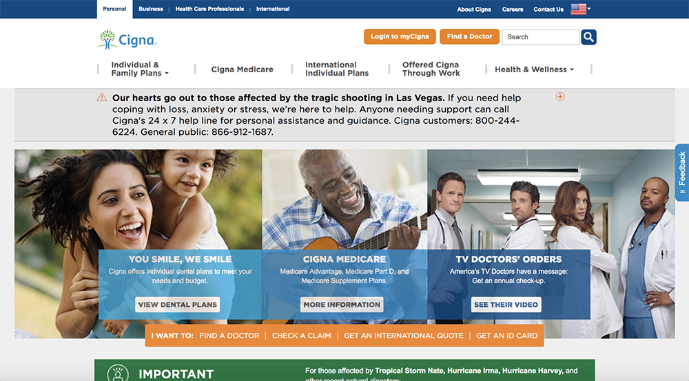
Aaaa! That’s what I think when I see this page. I don’t where to look or what to click. There’s so much text and way too much information. There’s pictures and calls to action and buttons and colors and everything is just out there. No clear design hierarchy or path for navigation. In short, I am overwhelmed.
Take a look at it now:
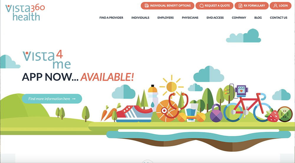
Wooooooow it’s so beautiful! And clear! Far from being overwhelmed, the bright colors, clear shape, and obvious design hierarchy make me want to hang out at this site forever! I feel like a real human created it.
I click on Individuals and look at this:
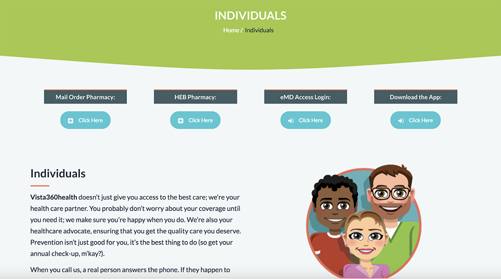
Bottom line: this website is beautiful. I can find my way around without getting stuck or frustrated. I can tell the company put a lot of thought into making it easy for me, which means they value me. I like a company that values good design and a human touch. They’ve made me a happy customer.
Before:
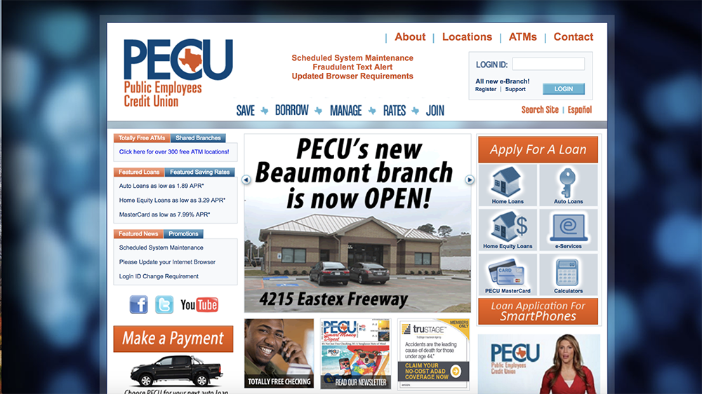
Oh, dear. I think this is even worse than Cigna. Problems:
In short: I don’t want to do business with this place.
After:

There it is! This is a site I’m happy to navigate.
Bottom line: Millennials are wary of banks (see: bailout, shady business practices). I know credit unions are different, but it’s still a financial institution. It’s more crucial than ever to show that you understand us and value us. This website acts as a great resource for me (because I’ll do a bunch of research before ever picking up the phone to talk to you) and shows a business that, when I’m ready to talk to, I can trust.
Times Are A-Changing, But They’re Mostly The Same
Millennials may behave differently than what you’re used to, but at the bottom of it are the same basic needs: we have problems we need you to solve, and we want to trust you to do it. We just want to see more of the people than the corporation.
Let’s build the solutions your business needs to grow.
Book a strategy callLet’s build the solutions your business needs to grow.
Book a strategy call